Founded in 1982, the UK u3a movement (based loosely on the French model) started in Cambridge and quickly expanded in the UK to a coordinating body for the majority of U3A called the Third Age Trust. https://www.u3a.org.uk/ Cambridge U3A https://www.u3ac.org.uk/ did not join because of the contribution to this central body was going to be cost wise prohibitive with their membership in the thousands. They still stand alone as a separate U3A entity. Above left is the original U3A design adopted in 1981-82. Detail of the U3A Cambridge UK founding is here >.
The NZ U3A website Logo. It became apparent to Garry, who had a background in graphics design, that there were a number of problems with the original design. The use of a numeral between the letters made the "3" appear too narrow. Hence a change to a wider "3" and to incorporate a "koru" effect to reflect NZ. Then there was a problem of colours with newsletter printing in Black and white and in webpages with the clash of background colours. The "A" with a mountain peak was incorporated to reflect an aspect of NZ.
In a review for this posting, we looked at the NZ U3A using the various logos on their websites. Hence in the next section "U3A Logo - Choice" the creation of singular colours. Some NZ U3A didn't like this website modifying the original design change. However some embraced the changes and a few went further with their own designs. Many have adopted a simple text "U3A". Others have created their own design and there is a mixture of original design and the ones created by this site. This website is not a national body and an attempt to set one up was widely opposed in 2014. Hence no standard to say whats wrong or right!
U3A UK LOGO REPLACED October 2020
The 1982 U3A logo has been replaced and is no longer used in the UK.
www.u3a.org.uk rebranded itself at the end of October 2020 and included the words "Learn, Laugh, Live". The last examples shown in the next panel demonstrate the new design. Of note also they have removed all reference to "University". Download the full story on their "Guide to their new branding".
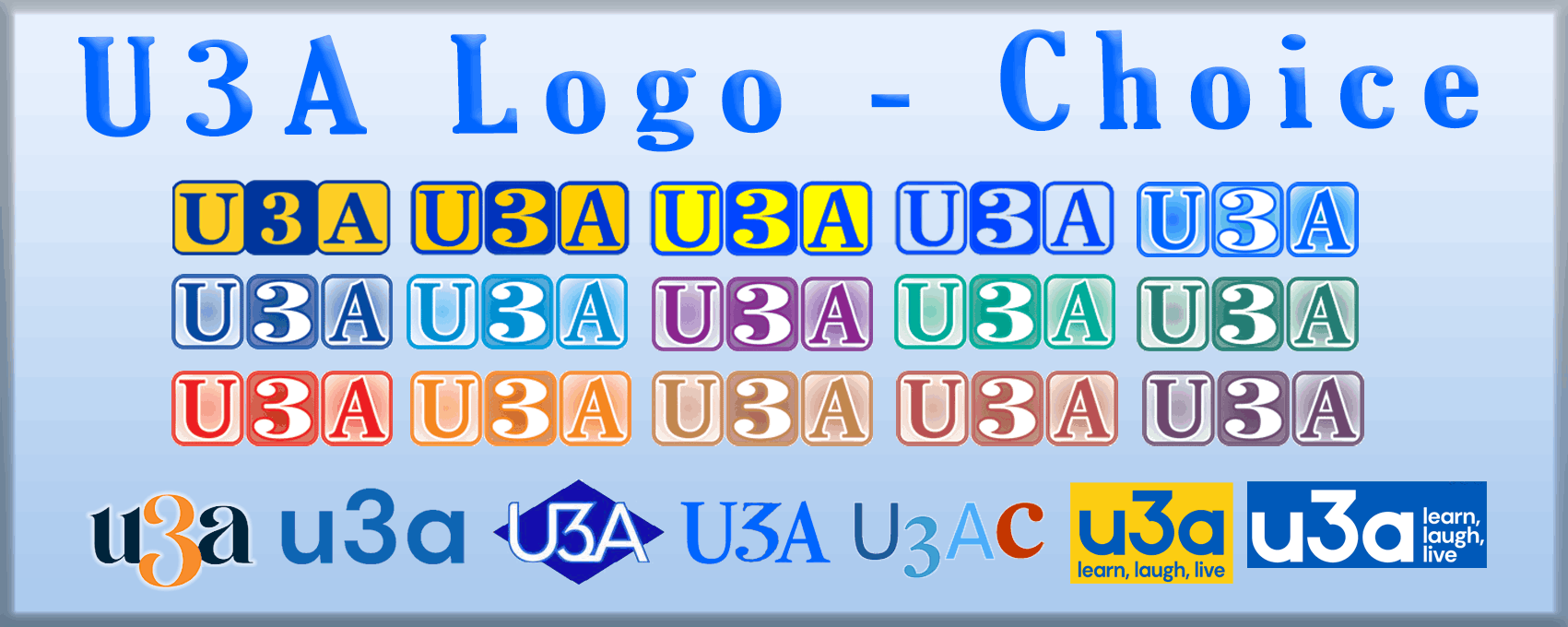
Top Row: 1. Original U3A UK 2. NZ Adapted 3. NZ Background Yellow 4. NZ with Transparent background 5. U3A NZ Website
Second Row: Various colors. The 3rd logo used on Canterbury website
Third Row: Various colours
Forth Row: 1. Cambridge NZ U3A 2. Many NZ websites use basic text 3. Meadowbank U3A 4. Gisborne U3A 5. U3A Cambridge UK 6 & 7. U3A UK 3rd Age Trust
Considerations for NZ U3A
- Rebrand the U3A logo to a more modern concept? eg Like Cambridge NZ U3A.
- Drop U3A "University" and replace with another word like "Universally", "Universe", "United", "Unity" or other "?" in the 3rd Age. Canada uses Third Age Network (TAN), USA has "Life Long Learning Institutes". Lets get the thinking caps on for a NZ rebranding or stay with the old, FEEDBACK HERE > & for logos as well.
UPDATE: Auckland Network has adopted the new U3A UK 3rd Age Trust logo above with no NZ identity.
EASY to REMEMBER - Direct links to every U3A in New Zealand using this sites sub Domain feature
On each U3A contact page, via this sites directory, there is listed: -
Local Home Page address: yourname.u3a.nz
eg for Takapuna it is takapuna.u3a.nz for Mt Aspiring it is mtaspiring.u3a.nz
Advertising your U3A, whether its by noticeboards or flyers, it is better to put a www. in front, as people will definitely identify that it is a web address. eg www.yourname.u3a.nz
This type of address is easier to remember and write down correctly even for those that have their own websites and more so with free or sponsored long address website names. If you have your own website, detail is not lost, as it is still available on your contact page on this site.
We aim to make it easy for new prospective members to find a local U3A without fuss and problems.
Look too at the other sections of your Local home page. Interest Groups and PDF Notice Board for Newsletters. There are some U3A that are not using this feature.
A good example of how this page is used is from a U3A at the top of NZ. www.hatea.u3a.nz There are many other good examples like Hatea. Compare your U3A with others, can generate ideas for new Groups. Garry Clark Website Manager
U3A WEBSITES to meet the needs of all current and trending Internet devices.
AMP (Accelerated Mobile Platform) + Responsive Websites. = Webpage layout and content changes automatically so that it can easily be read on all devices from Mobile phones - Tablets - Laptops and PC's. Less than 50% of U3A local sites meet this requirement. This means that non AMP or Response sites are outside the easy reach of 85% of local U3A members and prospective members.
This website is RESPONSIVE www.u3a.nz. View site on Mobile phone, Tablet and Laptop/PC to see how the content adapts / responds on the different devices.
SPAM - Phone and Computer HACKS
Many of us are receiving unsolicited internet provider hoax phone calls. Sometimes the callers number number is revealed. With that phone number its good to report it to Netsafe along with other experiences. Netsafe have tips, Guides, Safety Advice and the latest scams.
https://www.netsafe.org.nz/ The more reports that are made, means that the police and Telecom providers can take action at current trends.
To Receive - EMAILS - WEB BROWSE - SOCIAL MEDIA
2019 - 42% of users use Mobile phones to access emails
2022 - 85% of users use Mobile phones to access emails
Reference link >
Significant growing trend towards the convenience of Mobile Phones..
In June a test survey was conducted from 3 U3A Study groups totalling 21 people.
1. The device most used for viewing emails:-
1st Mobile phones, 2nd Laptops, 3rd PC Computer, 4th Tablet, 5th Kindle.
A significant number used both laptops and Mobile phones together. 70%
2. The device most used to Browse the Web - eg Google search
1st Laptop, 2nd and 3rd equal, Mobile phone and PC Computer, 4th Tablet.
Laptop 47%
3. The most popular Social Media Access programs.
1st, YouTube, 2nd Zoom, 3rd Facebook, 4th WhatsApp, 5th Pinterest, 6th Skype/Messenger, 7th Instagram, 8th equal Twitter and Snapchat. TikTok zero followers!
Youtube 85%
Summary: Worldwide, 85% of users use Mobile phones to access emails. With a significant number of U3A members eg 70% using Mobile phones to access emails. Maybe you would like to try this type of survey with your U3A.
This device survey leads onto the the next relevant noticeboard topic about Newsletter delivery.
Are U3A's communicating in the best possible way, format wise, to members?
Comment and Feedback:
"We use MailChimp, the free version which works fine" - Bay of Is
" Can create a template with Google docs, formatted as a table and then pasted into a Gmail message and stored as a template ready to use any time.
This method was used to deliver the U3A NZ email.
Email embedded Newsletter
Gone are the days when Newsletters were posted out to members because of cost.
A4 pdf - A5 pdf Newsletters - best practise
a) Number of words per line.
For optimum readability, a good guideline is between 9 and 12 words for unjustified text, and between 12 and 15 words per line for justified text. Note Newspapers have less words per line and are still very readable.
b) Font type and size are crucial and depend on the font. Recommending 12,5 13 14 point for normal text. (The first two font sizes can be typed in, they are not in the dropdown menu)
Readers will experience that it is easier to read a book, than many Newsletter formats. It seems that many editors have followed the Microsoft Word standard newsletter formats. Why not a Newsletter in the A5 pdf portrait format, similar to a popular book page size. Reference link > A5 Newsletter Sample >
Newslettter PDF on Mobile phones on Tablets
Its near impossible to satisfactorily read a A4 Newsletter on a mobile phone.
1. The text is too small and does not adapt to the screen size. The scrolling needed, would not be an easy task.
2. On the Mobile phone the Adobe PDF application usually requires a download from the App store. Even then there is harvesting of information Adobe requires. Some Mobile phones have their own pdf converters and can produce differing results.
3. The A5 pdf Newsletter has been trialled over a couple of years and it is perfect for Tablets, better than A4 on Mobiles, but still not free of scrolling and pdf application issues. A5 Newsletter Sample >
4. To see a pdf Newsletter on a mobile phone, the file has to be downloaded and then opened. Sometimes attachments are missed ( not seen ) and therefore the Newsletter communication has missed its target.
5. The research shows that the open and read rates for pdf Newsletter is very low. Sorry newsletter editors. Could be as low as 30% according to MailChimp. Other research paints a dimmer picture here >
Email embedded content: Adverts, News, Accounts & Newsletters
If you receive emails from Govt departments and Marketing emails such as sales, promotions, you will noticed that the contents are readable on all your internet devices from PC's to Mobile phones. The text size changes, the line length varies and the only scrolling, is to swipe down the page as you read. The emails are Created with products like MailChimp (They have a Free version) and there are many more here > Also see editors note under Internet Trends.
Benefits of a Newsletter as part of an email message
1. Instant view of Newsletter
2. Newsletter not lost as a download
3. Easy to read and scroll down the page.
4. No need to purchase Microsoft Word and create a pdf
5. No need to use Adobe PDF Reader
6. Easy to print and save